In this post I want to give you guys a bit of insight into how I plan the content for each issue, and how my approach is somewhat different and simpler to that of other magazines. But let’s start with a few thoughts on creating an enjoyable reading experience.
One of the beautiful things about printed publications is what Craig Mod calls ‘the edges of print’. We all know how great it feels to open a new book — the excitement of a fresh start. But also to be able to finish it, to close it and to move on to the next one. What happens in between those events is quite a linear experience. While magazines are also great for 'quick dips’ and reading in small chunks, most of us start from the front cover and work our way through to the final page. Compare this to consuming content online: how often do we start reading an article only to find ourselves watching a farting cat video because we clicked on a link half-way down the page? There aren’t any edges in digital.
This is one of the reasons why printed publications are still such an attractive tool for storytelling. Because content consumption usually flows in a linear direction, editors can create a unique journey that has a clear start and a clear finish.
When I first thought about Offscreen and how I wanted to present the content inside, the idea of arranging stories in an engaging way was exciting, but also quite daunting. The first step towards clarity and action was to define some basic boundaries, like the page count and the dimensions of the publication. Once I had some physical limits, I experimented with typography and grids within Indesign, trying to come up with a versatile set of ‘templates’ and a consistent visual direction. I won’t go into detail about this phase here, but let’s just say I bought a lot of font licenses (which I didn’t end up using) and printed out a ton of sample pages in the process.
All of the above sets the constraints for how much content I could fit into one issue. The next step was to come up with a way to organise my ideas to see how they flow in the context of a magazine. This is where the content plan (or flatplan) comes in. The content plan gives you a bird’s eye view of an issue. It allows you to pace the reading experience by placing and moving around story ideas with the goal of creating an enjoyable and captivating content flow.
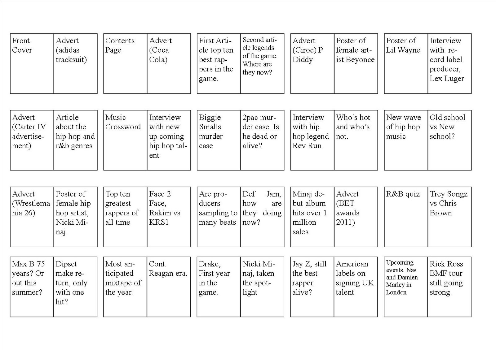
There are various degrees of detail when it comes to content plans. It often starts out with something like this:
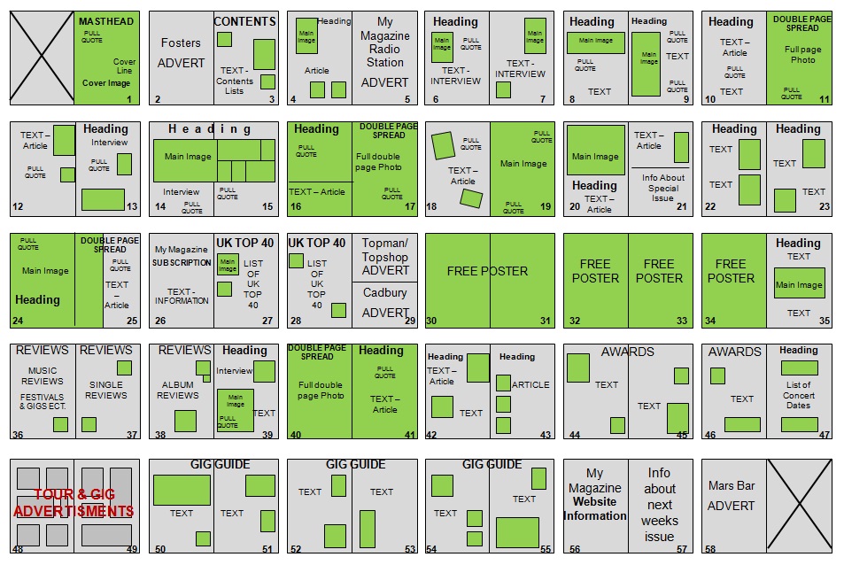
…and then often turns into a more detailed version such as this:
At a later stage, once content is coming in and the editorial designer begins with her work, the content plan takes a more realistic shape as printouts stuck to the wall or laid out on the floor:
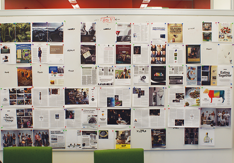
Seeing all the spreads next to each other enables editors to identify critical areas where, for example, stories or visuals are colliding. These printouts also give creatives an idea of how the layout of a particular spread work in the context of the bordering pages.
Being a kid of the digital age, I don’t really have an office with a big wall or a lot of floor space. I move from place to place quite a lot and take my office with me when I do. So I decided to take a more digital approach to the content plan: a simple spreadsheet. Although I do print out the magazine in its entirety on my trusty ol’ laserjet, mainly for proofreading.
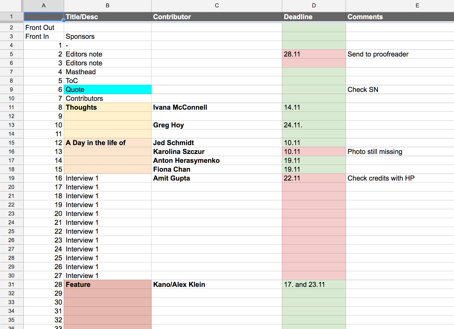
This document stays open as a pinned tab in my browser throughout the three or more months it takes me to create a new issue. It’s a constant work in progress. As contributors confirm (or drop out), I add/edit names and deadlines accordingly. During the 3-4 week period when the majority of content is due I run through this document from top to bottom at least 2-3 times per week to check on the status of each contributor. This is by far the most stressful period in the making of an issue as I have to replace the inevitable drop-outs last minute and remind already very busy people that they are running late. If a piece is complete (written and visual parts have been submitted in their final version) I colour the cells in the 'Deadline’ column green. I repeat this step until the last piece of content has been submitted and I can move on to the next stages (proofreading, final editing, and eventually laying out the issue in Indesign).
The content plan is one of the most important tools in the making of a magazine. There are many magazine titles out there that do an amazing job at creating a unique reading experience and taking the reader on an adventure with every new issue. I won’t lie, Offscreen is not one of them. The core structure has intentionally not changed much since the inaugural issue launched. My lengthy interviews set the pace and make up the bulk of each issue. Changing smaller features in between break up the reading experience into digestible chunks. It’s a fairly strict pattern that I’ve come to rely on, not least because I’m a one-man show which necessitates a fair amount of routine to be able to make three issues per year possible.
Update: There is now a handy little online tool called pageplanr for easier flatplanning. I haven’t tried it yet, but it looks great.