Over the next few weeks I’ll be sharing a selection of my Rebranding Diary emails. These emails went out to backers of my fundraiser every Sunday between August 2016 and March 2017. I’ve made some updates to these emails to adapt them to the blog’s open format. First up: my decision-making process for settling on Offscreen’s new typeface, Acumin. First published on Sep 10th 2016.
Going through the editorial design inspiration that I’ve been collecting for a couple of years now, you can see that I like mainly type-driven spreads, using only a few simple elements combined with one or two (often subdued) colours. This is where the redesign of Offscreen is headed. The goal is to further reduce and simplify, to create a placid reading experience accompanied by unpolished, real-life photography. I want it to feel as calm as reading a book and as personal and authentic as going through someone’s photo album.
How can a typeface assist in that goal?
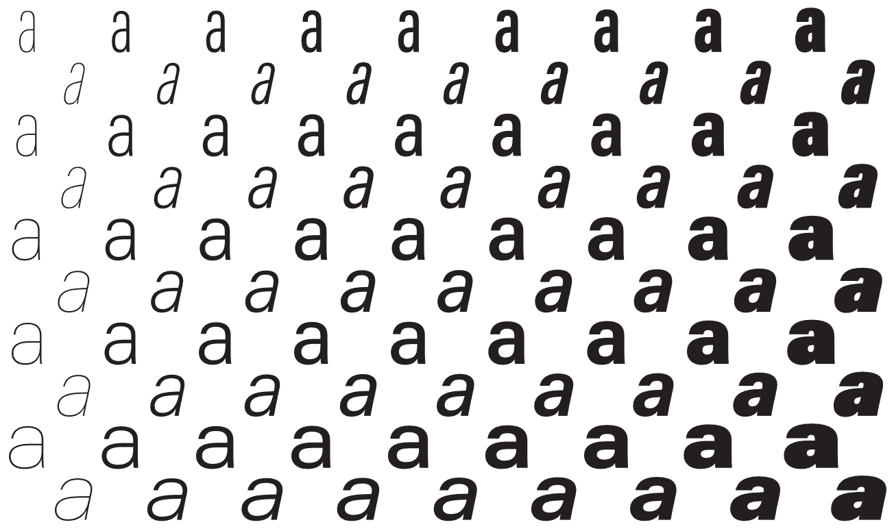
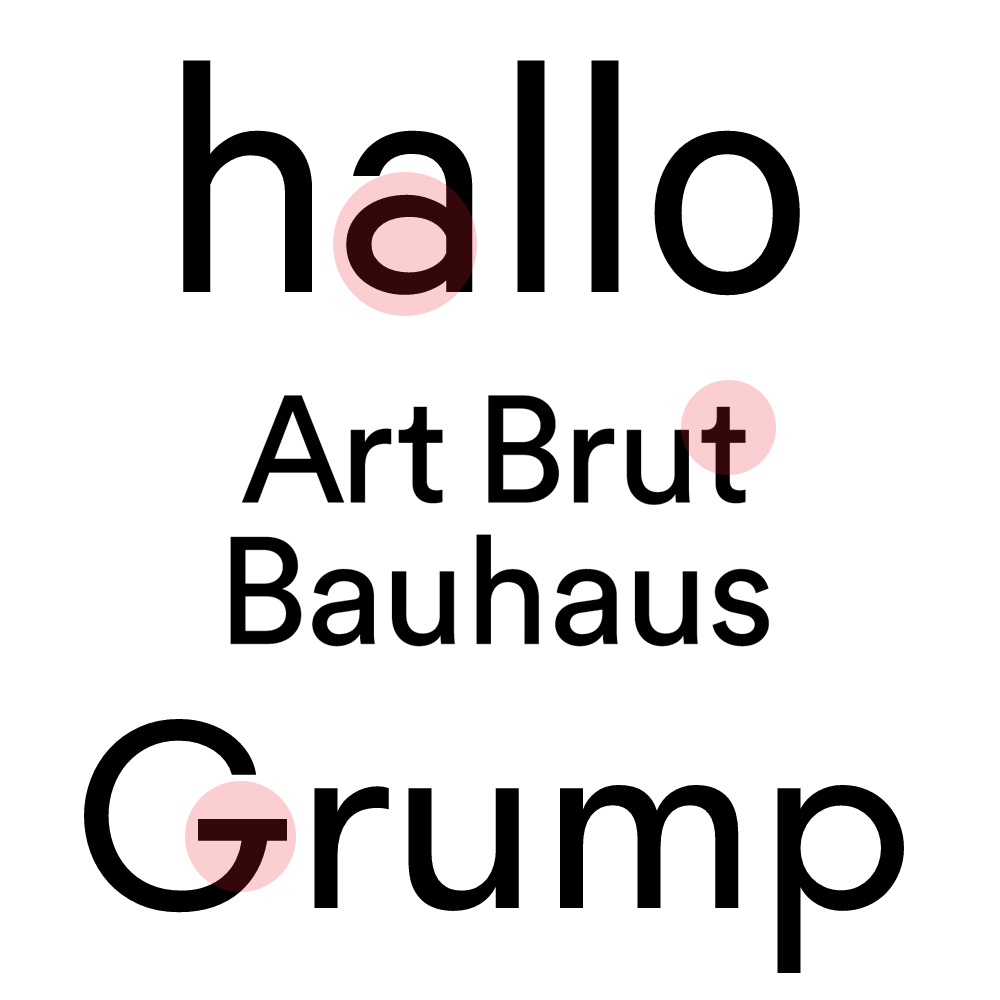
Most typefaces contain a few distinct letters that give it away quite quickly. For example, the unique shape if the lowercase ‘a’ in Calibre, the curve in Circular’s lowercase ‘t’ or that prominent crossbar of Walsheim’s capital ‘G’.
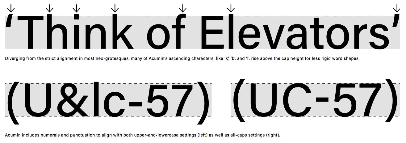
Perhaps that’s why, when I came across Acumin, it didn’t trigger any particular reaction at first. In a way, Acumin is spectacularly unspectacular. It’s a pretty ‘straight-faced’ sans-serif type with few characteristics that stand out. It doesn’t really make much of an effort to grab your attention or sell itself. [Writing this I’m realising that I’m kind of describing myself/Offscreen.]
I love going through the websites of type foundries to explore the stupendous amount of work that goes into designing typefaces. When I buy new things I’m usually rooting for the underdog, so I was eager to support smaller foundries. Acumin was commissioned by Adobe, another reason why I didn’t really pay much attention to it. Not that I dislike Adobe in any way, but as a tiny brand I know that every paying customer can make a big difference. And so after a lot of research, these were the typefaces I set out to test:
- Post Grotesk by Incubator
- Atlas by Commercial Type
- Graphik by Commercial Type
- Lab Grotesque by Stockholm Design Lab
- Neutral by Typotheque
- Founders Grotesk by Klim
- Maison Neue by Milieu Grotesque
- Suisse by Swiss
- Agipo by RP
- RM Pro by The Designers Foundry
- Zurich by bitstream
- Theinhardt by Optimo
- Aktiv Grotesk bu Dalton Maag
- Unica by Linotype
- Neue Haas Grotesk by Linotype
- Acumin by Adobe
On my initial shortlist was Suisse International, Aktiv Grotesk, Atlas, and Post Grotesk. Some testing showed that Suisse and Aktiv Grotesk just ran a little too wide in body sizes. This meant that I either had to cut down on content, reduce the font size or add more pages – neither of which was an easy thing to do. Both of those typefaces can feel a bit too modern and cold. In contrast, Atlas and Post Grotesk are beautifully human and amiable, yet I simply didn’t enjoy them as text fonts. What makes them so friendly and a bit quirky gets in the way when reading long passages of texts, in my opinion.
Once I ruled out the ‘too cool’ and ‘too playful’ types, I was left with something in the middle, something quite neutral. I was looking for a less ‘trendy’ and overused version of Helvetica. This eventually led me to Neutral (duh!) and back to Acumin. Neutral is amazing, but Acumin’s much larger family was very appealing.
After devouring Acumin's wonderful microsite, I did a bit more digging and came across a post by a familiar face. Jeffrey Zeldman has high praise for Acumin. He calls it “a Helvetica for readers”. And I couldn’t agree more with his observations:
Reading about the design challenges Slimbach set himself (and met) helps you appreciate this new type system, whose virtues are initially all too easy to overlook, because Acumin so successfully avoids bringing a personality to the table. Enjoying Acumin is like developing a taste for exceptionally good water. (...)
Book designers have long had access to great serif fonts dripping with character that were ideal for setting long passages of text. Now they have a well-made sans serif that’s as sturdy yet self-effacing as a waiter at a great restaurant."
After I ran several rounds of test prints, it impressed more and more. Offscreen is a very small, book-ish magazine, so the typeface has to perform in relatively small, compact spaces. Acumin scales beautifully, no matter the font size. Since I’m an Adobe Typekit user it was easy to test Acumin’s webfonts extensively too, and again, it performed amazingly well on screen.
The microsite claims that Acumin was “developed with the highest standards for aesthetic value, technical quality, and typographic functionality”. That may sound like some cliché marketing speak but I have to admit that there is a certain level of quality in fonts made by big foundries like Adobe or Monotype. Several other fonts I tested had kerning issues at certain sizes or the performance on screen felt more like an afterthought (which is often the case when custom fonts become retail fonts).
What’s also nice about Acumin is that it hasn’t become a the go-to typeface for every new magazine or startup yet. I tend to come across the same ten typefaces in so many magazines and websites these days, but Acumin hardly ever makes an appearance.
So, there you have it. As I’m writing this I’m pretty set on Acumin. As with everything though, I might still change my mind (the advantage of not having to report back to anyone other than you lovely people), but given how much time I’ve spent testing this typeface in various scenarios I can’t see myself doing that all over again with another typeface in the foreseeable future. Having said that, I fall in and out of love with typefaces fairly quickly. 🙃
Since there are a few type designers amongst the readers of this newsletter I should say that I certainly don’t consider myself a type expert. I love discovering the technical details of how a typeface came to be, but in the end I arrive at my decisions to use a particular typeface mostly by ‘what feels good’, and my gut agrees with Acumin.